
this is article 3 of 5 in the dmaic problem-solving method series
The Measure stage is used to enhance and refine the definition you created in stage one. It finds clues that lead the team to the root of the problem, which defines the starting point of the process.
The Measure state provides even more definition to the current state by gathering data and information that tells us things like cost, frequency, and time. There’s a big difference between simply stating the problem and stating the problem with numerical data to back it up.
Data can also provide a baseline for assessing eventual improvement (or not). The collection and organization of current state data alone can point to possible causes of the problem.
To get started with measurement, the team can look back to the various elements of the Definition for direction and identifying candidates for Key Metrics; the Voices of Process and the Customer.
Selecting Key Metrics involves four elements:
- Failures or errors assess how often the “Voice of Process” or “Voice of Customer” specifics are missed.
- Cycle Times include the entire process, process steps, and delays.
- Throughput includes the total input and output.
- Costs include the actual and opportunity costs.
Measure: Collecting and Organizing the Data
Now that you’ve used Key Metrics to decide which data will be useful, it’s time to plan how you’ll gather, organize, and display the data. Generally, metrics data fall into one of three categories:
You have the data and it’s organized
In this case, all you need to do is to put the data into some sort of chart. (We’ll talk about charts later).
You have the data but it’s not organized
Organizations often have data…somewhere. They just don’t know where or they have to do hours of work to back track and compile it.
You don’t have the data
This condition isn’t very different from the previous one. You’ll need to go about your preferred data collecting method. You also must decide how much of the data to collect for how long, how to store and retrieve it, and how to display it.
Displaying the Data
The manner in which you display the data is important. You’ll want to display your data in a way that is effective for seeing patterns and trends, unlike your average spreadsheet. The data should be as easy to read and interpret as possible, and answer the question, “are we getting better, staying the same, or getting worse?” with respect to the particular metric you’re focused on.
Here is a list of different types of charts and when to use them:
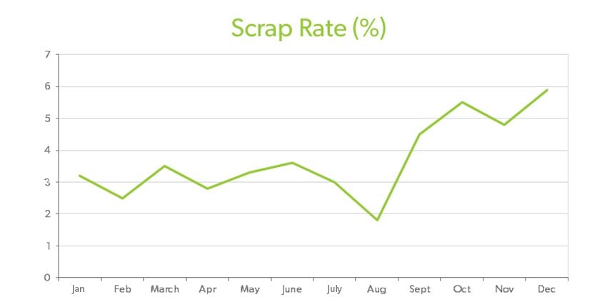
Line or Run Chart
If you want to use a chart that shows how a measure is changing over time, use a Line or Run Chart. Newspapers, magazines, television all use this chart daily to display things like stock prices. Let’s look at an example:
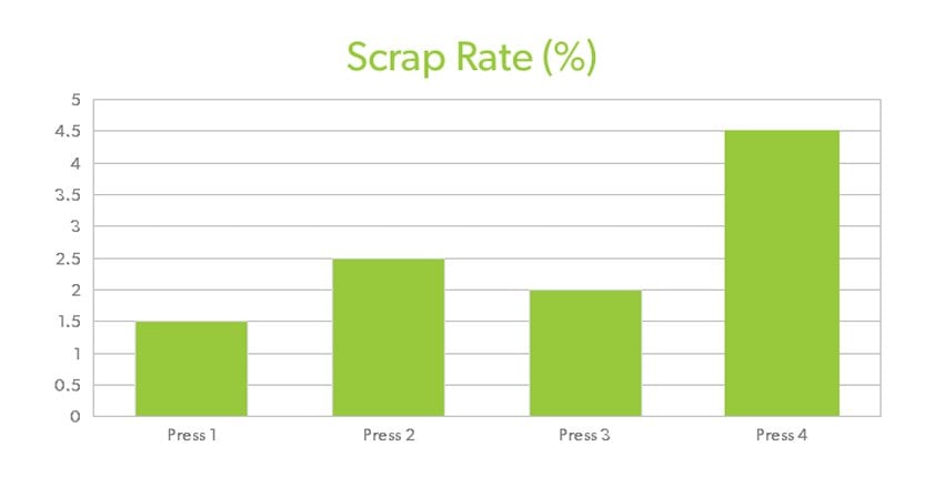
Bar Chart
Bar Charts are just about as common as Line Charts because they can also be used to show the change of a measure over time. They can be used to show comparisons, as well. Here’s a simple example that shows which press produces the most scrap:
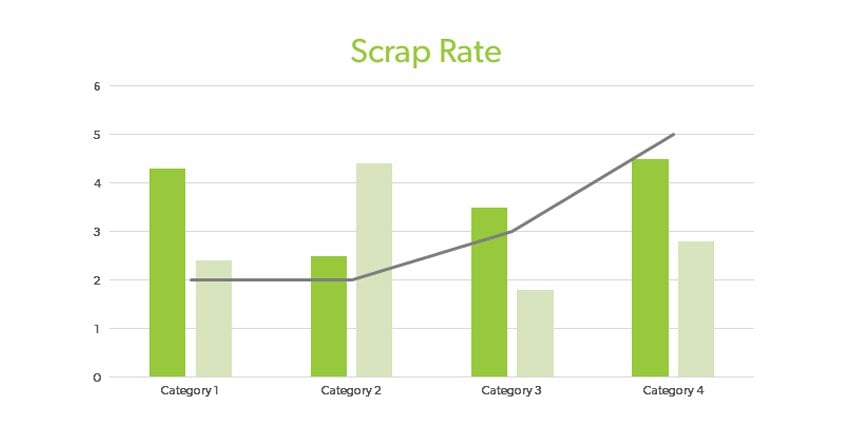
Pareto Chart
A Pareto Chart is simply a bar chart that shows how often the various types of problems or the potential causes of a problem occur. Such a chart shows, at a glance, which problem or cause is the most significant. Let’s look at an example:
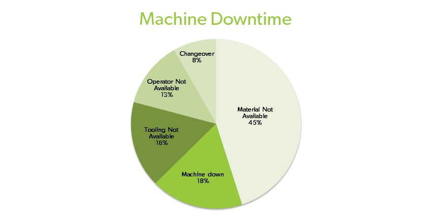
Pie Chart
Pie Charts are useful for displaying how a total group of something is divided in portions.
Continue Reading: Read the next article in this DMAIC series to learn more about the problem-solving method.

Six Sigma Training Program
This improves the quality of a company’s outputs by identifying and removing the causes of defects.